Deep rooted
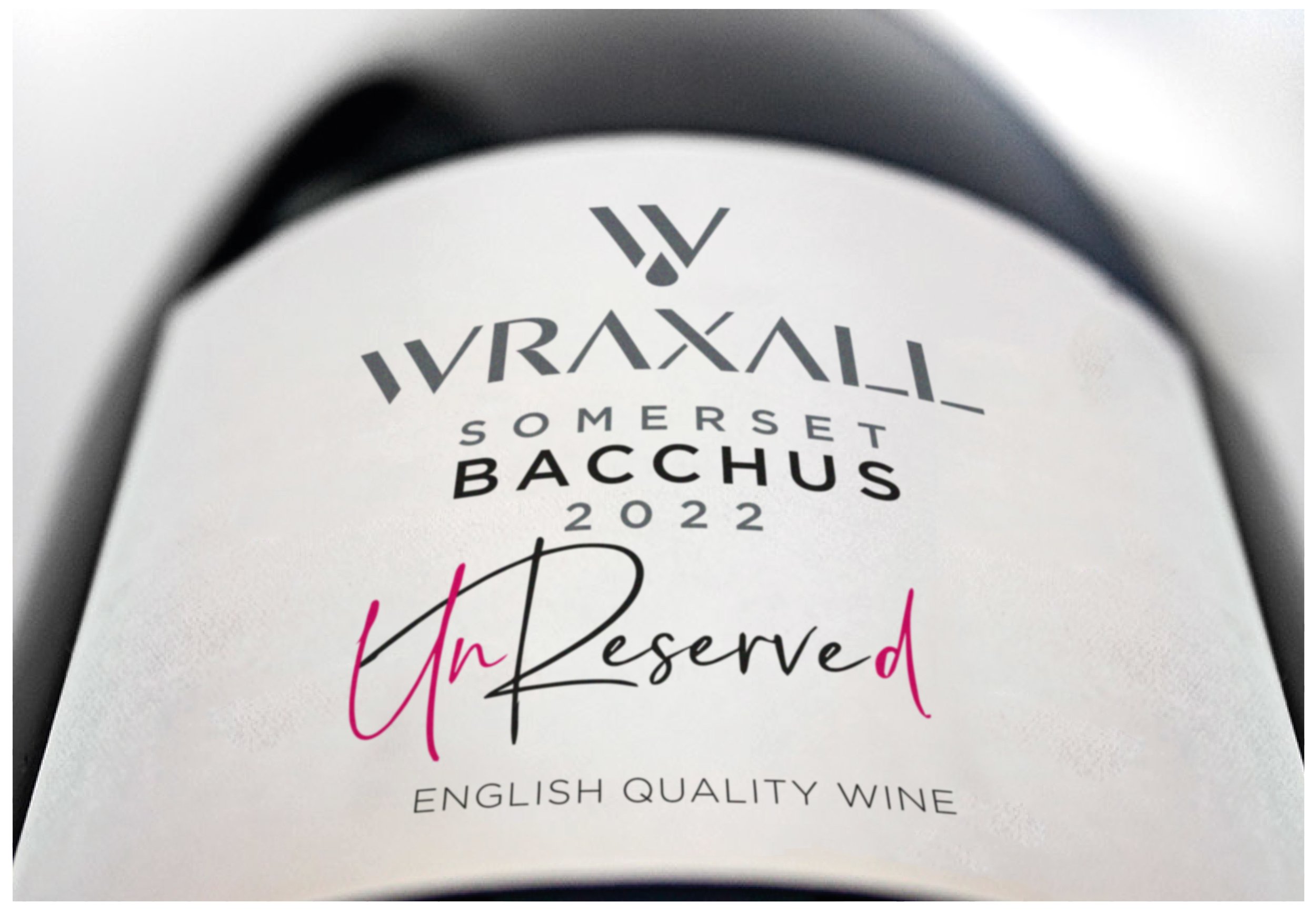
Wraxall is one of the oldest wineries in the UK with its original vines dating back to 1974. Catling Creative worked with the new owners to galvanise the vineyard and associated brand, ensuring growth for a further 50 years, working on brand positioning, a fresh new identity, beautiful labels across a varied range and brand architecture.
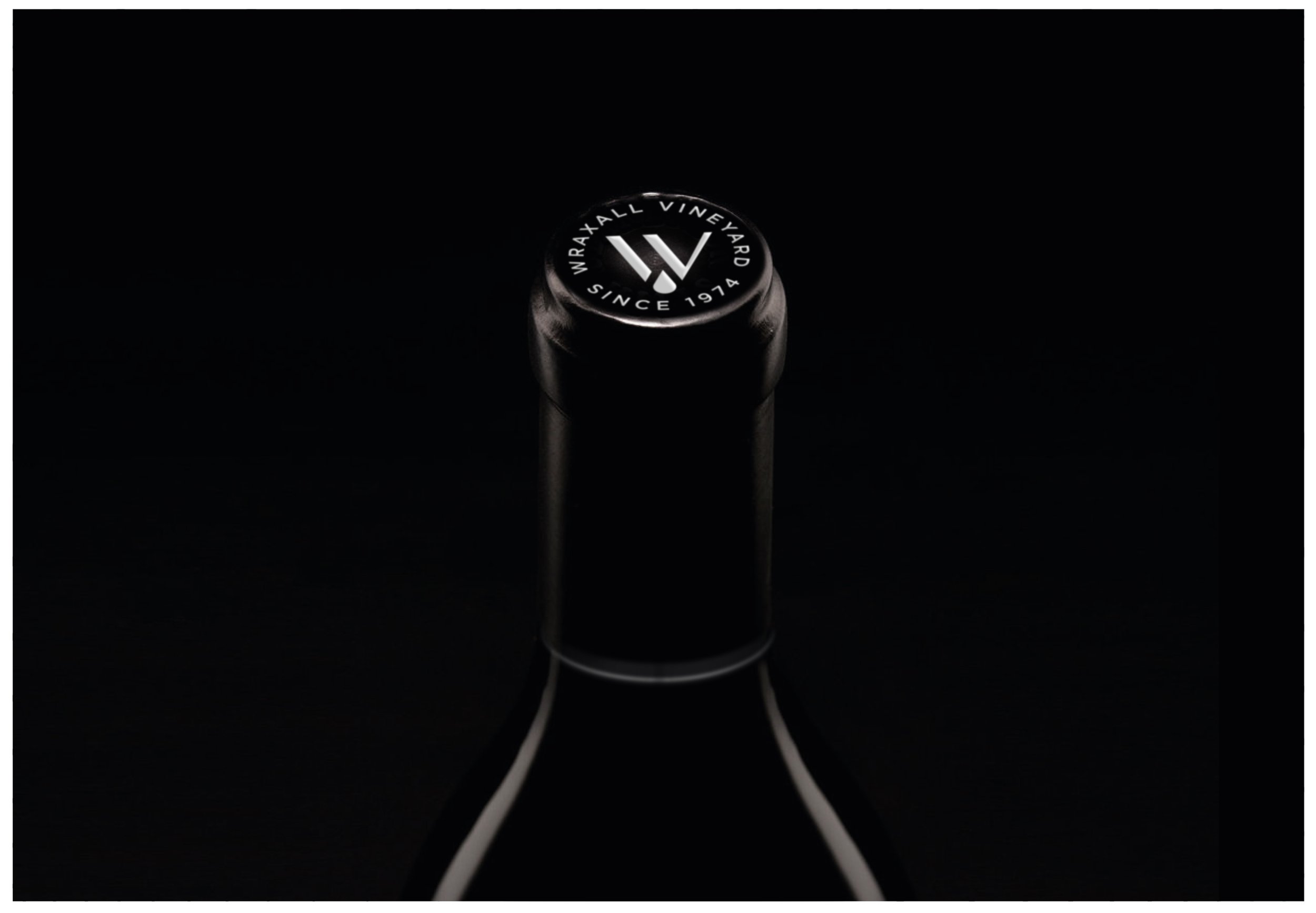
The new logotype and identity combine the W of ‘Wraxall’ and V of ‘Vineyard’ to create a distinctive brand signifier from which the harvested grape juice pours. The typography also subtly refers to the historical Roman connection of the area through the use of classic chiselled typography whilst being modern in execution. This combination of history and modernity is a concise shorthand of what the Wraxall Vineyard stands for: the best of yesterday fused with more contemporary techniques, culminating in award-winning wines.